
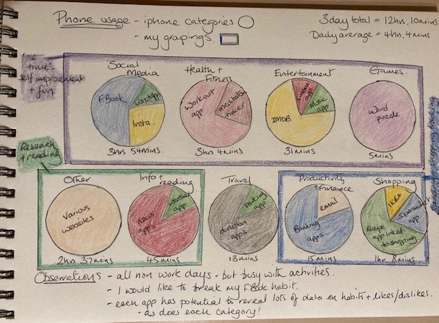
Screen time – visualisation
Having reflected on personalisation in a previous blog I wanted to consider the earlier stage of that process, data collection. To be able to have personalised information, such as targeted ads or tailored choices within a learning platform, there first must be data collected from the consumer to use as a comparator against other similar consumers so ‘personalised’ choices can be presented. I didn’t have to look far for a piece of technology that I use frequent that could be the subject of this type of data collection exercise as my phone is never far from my side! My aim was to find out just how much I did in fact use it, so I enabled ‘screen time’ and carried on with life for a few days before plucking up the courage to see what it had to reveal to me.
The usage stats were interesting in that they were reasonably consistent across the 3 days, so I took a note of the information, and disabled screen time!
My previous visualisations have been illustrated in days, with the findings for each day being recorded by volume/instances etc. For this task I wanted to think about the information a little differently, though some of this was done for me as the iPhone automatically categorises apps used into categories. I opted for a circle to represent each category with the content of the circle reflecting the app usage. I found the categories logical however there were other ways to divide up the data so I grouped them a little differently, according to my preferences.
Reflections on the screen time data
The first thing that struck me regarding the data is just how easy it was to find detailed information on what I had been viewing and interacting with, considering the other tech I interact with at home and work the volume of information felt considerably more than I had previously considered. Kitchin (2014) resonated here as he describes big data in terms of ‘volume, velocity, variety, exhaustive in scope, whilst also relational and flexible’. In a small way it made me appreciate how ‘modelling’ of an individual, essentially the datafication of the individual, could be done through analysing their data trends and behaviours.
I was also reminded of the phrase Knox et al (2020) highlight, as attributed to Rushkoff (2010), as the social media ‘user’ I was also the ‘product’, and if I was in the role of a learner I could be a ‘prized product’ when considering learner analytics, as the data derived from the learner could be used to help improve algorithmic systems.
This to me feels a step further from Biesta’s ‘learnification’ (2013) as education has not just moved on to be learning from a tutor/facilitator role, but the learner is not even the centre of the learning process anymore but is instead a facilitator themselves as they facilitate the learning analytics process which in turn feeds into the developing world of machine learning. The learner just happens to ‘learn’ along that journey whilst improving the journey for the learners coming behind them.
Reflecting on the content of the visualisation, or the data that derived it, I reflected on my habits in a more visual form and considered areas I may wish to change. Habits however are not always easily changed which is perhaps there is room for ‘nudging’. However, as Gaševic (2020) recalls, nudging has not been significantly used in learning analytics as it is not well aligned to the set-up of the learning platform/dashboard. So perhaps we may not see nudging being used to alter learner behaviours but perhaps is more successful in nudging people to better habits due to its incremental nature. Time will tell regarding that one for me and my social media habits 😉
References
Biesta, Gert. 2013. “Giving Teaching Back to Education: Responding to the Disappearance of the Teacher.” Phenomenology & Practice 6 (2): 35–49.
Kitchin, R. (2014). Big Data, new epistemologies and paradigm shifts. Big Data & Society, 1(1). https://doi.org/10.1177/2053951714528481 Big Data, new epistemologies and paradigm shifts – Rob Kitchin, 2014 (sagepub.com)
Jeremy Knox, Ben Williamson & Sian Bayne (2020) Machine behaviourism: future visions of ‘learnification’ and ‘datafication’ across humans and digital technologies, Learning, Media and Technology, 45:1, 31-45, DOI: 10.1080/17439884.2019.1623251
Neil Selwyn & Dragan Gaševic (2020) The datafication of higher education: discussing the promises and problems, Teaching in Higher Education, 25:4, 527-540, DOI: 10.1080/13562517.2019.1689388
I really enjoyed your post Jillian. Something you said in your first paragraph stood out to me – “there first must be data collected from the consumer to use as a comparator against other similar consumers so ‘personalised’ choices can be presented”. And later on you talk about how “The learner just happens to ‘learn’ along that journey whilst improving the journey for the learners coming behind them” (I’m still processing this statement, it’s so good!).
These are such great points you bring up. This idea that in order for the technology to be “personalized”, there must first be data. And in the context of classrooms, data can only be created by walking through the prescribed paths of learning set out by a piece of technology, making learning more of a by-product. Do you think that in any system that aims to “personalize” learning for students, the fundamental (and first) goal is always going to be for the system to learn about the learners, and for the student’s learning to perhaps be secondary to that goal?
Hi Meenakshi
Thanks for your comments 🙂 That is an interesting question you raise at the end about the fundamental goal of personalised learning. I am wondering if the answer is tied to point of view. The learner may feel their learning is the driver or core of the digital personalised learning process, perhaps a well designed system is meant to make it feel that way? Whereas within the Edtech organisation you may have subject specialists/teachers that are focusing on the designing the learning package in such a way as to ensure the best learning experience, therefore perhaps still having the learner at the core of the activity? However, those that work on the more analytical side of the business may be looking to improve the dashboard as their core objective so then the learner becomes the product and their learning being data they can use to enhance the product?
Perhaps it is another example of how the same data can be analysed for different purposes, which can bring with it a set of new problems! 🙂
This is a colourful visualisation and although it displays a lot of information, it is easy to understand and doesn’t need close scrutiny of an intricate key as in some of the Dear Data drawings!
Your decision to “think about the information a little differently” and group it by apps and your own categories rather than by days (as you have previously) bears out your intention to think about personalisation. It makes wonder whether it would be useful for learners/consumers/users to have a choice in the way their data is presented to them. What do you think? Would that be a more effective way of ‘nudging’ students – by giving them some agency? It’s great to see how the literature has prompted and deepened your reflections. I really liked the picture you painted of the learner on a journey unwittingly working to improve the path for those coming behind – a powerful notion!
Hi Cathy,
Thanks for your comments. Picking up on your idea about the information being presented differently to students did get me thinking. It also relates back to the discussion we had online at the tutorial the other day. In particular it made me think about the ‘AI classroom’ and the volume of data collected from students. I wonder how this is filtered and analysed, is one type of data, for example face expression or what the student said, given more agency than another? If so does this skew the overall picture of performance. Even if the specific presentation is not intentionally weighted towards one piece of data could this be done without intention in how the data is presented if one area of the data is given more space on the dashboard or is even just the more accessible data presentation?
I know that previously I have been presented with the same data but in more than one format, for example tables, graph and box plot, and I know I have a preference towards certain visual formats (which I tend to look at first) but I hadn’t considered if the order I review this information, or if I were only to be have it presented in one format would influence my opinion on what the output of the data is showing? Definitely needs a little more considering and I might keep it in mind when creating my next visualisation.