
Communication load & data uses
In my earlier blog Communication flow – My Critical Data and Education Blog I noted that I wanted to consider communication I received through specific channels at work, within a set time period for my visualisation. The categories recorded were:
- How the information was communicated to me
- If the communication required me to:
- undertake a specific action
- absorb and/or store information
- provide an opinion on a general or corporate policy matter, not directly related to my portfolio of work.
When considering the data to construct a visualisation I was struck by the fact that the more interesting aspect of the collated information was not what I had anticipated, with the focus of my attention being drawn to the comments noted alongside the categories. The following picture shows my attempt to categorise these comments, whilst retaining a link to the method of communication.

What I found was a trend in the types of information that I was interacting with, the communication format meanwhile had become almost irrelevant. The priority level of the activity also became a strong feature of the collated data. I therefore opted to focus on these two key areas for my data visualisation. I used the priority rating to split the data initially into two large categories (low and high priority) and within these two categories I used symbols to indicate the activity (action, information or opinion) whilst ensuring that I linked this with what type of information I was being asked to interact with (planning or scheduling, seeking guidance on an issue within or related to my portfolio or seeking guidance related to general policy or corporate activity).
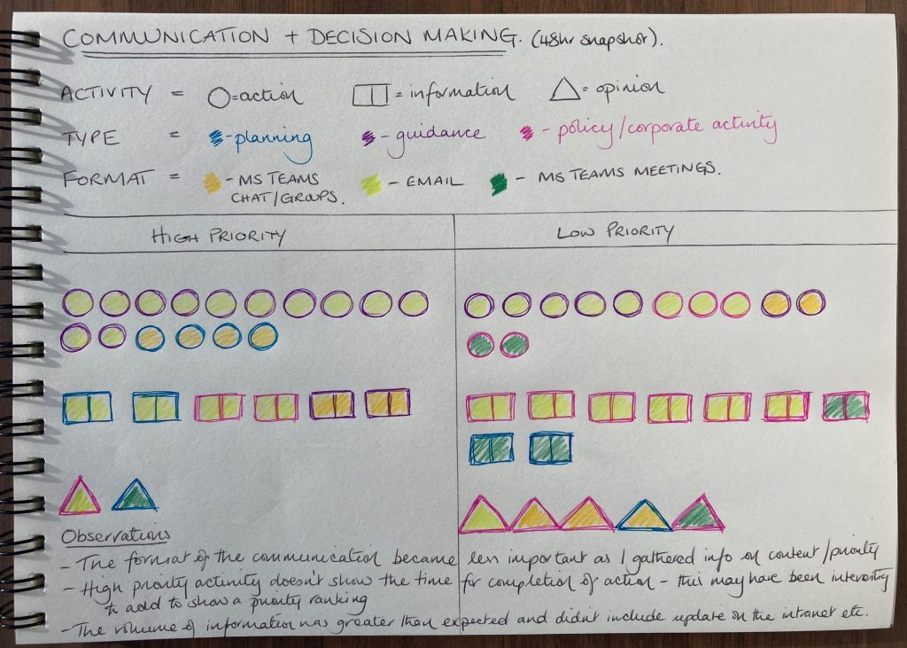
Data visualisation – communication load
Overall, I hope the visualisation provides a clear presentation of the types and volume of information presented, and well as the balance between high and low priority. However, on reflection although the visualisation does reflect my experience of that short time it is perhaps lacking in capturing key details, such as how long activities took to deal with, therefore the visualisation perhaps does not present a truly complete picture. For example, some of the low priority actions did not take long to complete so although there are several of them noted the level of ‘work pressure’ from these activities was low. Whereas many of the activities in the ‘high priority’ areas were time consuming and often required detailed discussion with colleagues before answers could be provided or opinions given. One of the ‘opinion’ triangles required research before the meeting took place as well as discussion with relevant colleagues before an approach could be agreed. There isn’t anything in my visualisation that captures this. To be able analysis the communication fully, for example to assess if the level of communication was manageable in the time frame, then additional information would need to be collected. Some examples of areas that could be added include:
- Length of communication – a short email asking a question is quite different to a complex policy document that needs to be reviewed.
- Level of importance/complexity of the communication – I thought this would have been potentially captured through the ‘priority’ category however some communications had a quick turnaround time due to deadlines needing to be met but the level of information being provided was very straightforward. On the other hand, there was wording within policy documents that needed careful scrutiny to ensure messages were communicated to stakeholders clearly.
- Other types of communication – the information I captured was linked to specific communication channels (partly for ease of recording, and partly as it can be difficult to capture conversations which span a wide variety of topics). However, this means that there was communication activity that wasn’t captured, therefore the data and visualisation only represent a snapshot of activity rather than a true reflection of all communication that took place over that time.
These potential areas of improvement, or expansions of the exercise that I completed, made me reflect on how information is presented to teachers on dashboards about their learners. For example:
- What information is not being captured? Data gathered on learners only reflects the interaction they have with that specific piece of software or platform. Is there potentially therefore for learners to be misrepresented as any interactions/further study outside of the platform or just ‘thinking time’ aren’t captured. This ‘invisible’ or ‘unknown’ data (Williamson et al, 2020 p.352) impacts on the value assigned, or not assigned, to the data that is ‘known’, or ‘visible’. Similarly, as van Dijck (2018) reflects ‘Aggregated data about learning behavior provide the input for individual “adaptive learning” schemes.’ (Van Dijck et all 2018 p.121). Without complete data is there a risk that wrong assumptions are made about learners resulting in personalised or even adaptive learning not being suitable or the best fit?
- Is the most important data being given the correct level of agency? When teachers are presented with data is there an assumption that the ‘best’ data has been captured. With potentially some data being considered not relevant or of little importance by those that designed the dashboard/created the analysis algorithms? As Brown (2020) reflects, a lack of clarity on how data was assembled’ (Brown 2020 p.393) had a direct impact on the ‘sense making’ of the data. To be able to interpret what is presented there is still a level of understanding of how the data presentations were arrived at.
- How much information is too much? Looking at my visualisation I can easily see that someone else just considering the information presented could make assumptions, for example on the potential manageability of the ‘communication volume’ however the picture only tells part of the story. Adding a layer of additional information to the data and working this into the visualisation could allow for different assumptions to be drawn. Reviewing and drawing conclusions from the data, even when presented in a formatted dashboard, however is something that can take time. As Brown (2020) reflects on his comparative case study the lack of time and instructor experience using data was a factor which ‘deterred STEM faculty from acting upon data during instruction’. (M Brown p.386).
A key theme for me from this visualisation process has been around the value or agency assigned to each piece of data (known or unknown). The value of the data can be one of the main drivers for the data analysts to use to create algorithms, to then have designers use to present to teachers for their interpretation. If data are not assigned their ‘true’ value because key data is missing, or its importance has not been recognised, then the output of that analysis could be unreliable. Leading to a misrepresentation of information and assumptions about learner performance which may underestimating, or overestimating, their skills level.
References
Brown, M (2020) Seeing students at scale: how faculty in large lecture courses act upon learning analytics dashboard data, Teaching in Higher Education, 25:4, 384-400, DOI: 10.1080/13562517.2019.1698540
Van Dijck, J,. Poell,T,. de Waal,M,. (2018) The Platform Society. Oxford University Press. https://doi.org/10.1093/oso/9780190889760.001.0001
Williamson, B. Bayne, S. & Shay, S. (2020) The datafication of teaching in Higher Education: critical issues and perspectives, Teaching in Higher Education, 25:4, 351-365, DOI: 10.1080/13562517.2020.1748811

I really enjoyed seeing your visualisation and reading your reflection Jillian. You’ve raised several good points here that I’ve been thinking about myself during this block.
The point you made about how value is constructed through algorithms is really important. I would assume this is very difficult for any technology provider to get right. How could they when they’re constructing general algorithms that are then used by many different institutions. They’ll be generalised at best, and I suspect not allow for customisation based on the many different contexts they could be used within.
I also like your point about the potential for learners to be misrepresented. This is certainly happening at varying levels throughout education and I don’t think any learning analytics solution can make an entirely accurate representation of students. For me the frustration is that these technologies are often sold/licensed on being a complete ‘solution’. Whereas they are just one limited feature in a complex picture. I think learning analytics providers would have a lot more success if they weren’t mis-sold, or oversold.
I’m wondering if any non-profit learning analytics tools have been developed, that are far more modest in their claims? I’d like to see technologies that are transparent, configurable and give credit to the complex assemblages around teaching and learning.
Do you think such things exist?
Hi Ross, thanks for your comments, and for the end question which is a really interesting one! I was reminded of a podcast I listened to recently which discussed search engines and how these have changed over time. There was an interesting conversation with one search engine provider that doesn’t use ads as they have a chargeable service instead, which as a result means they don’t need to data mine searches for user data they just need to provide a good service and try to beat the competition on results. As you would imagine they are a small, but growing, business (especially compared to the big players), but it can’t be easy trying to convince users to pay for a service they normally get for free if the users don’t appreciate they are the product and not just an end user!
It did make me wonder if there would ever be a market for EdTech where the data was only ever used for platform/service improvements, and even then the ‘data mining’ would be limited? Perhaps the cost would be too prohibitive to function like this, or companies would be unwilling to consider it as there are too many potential data analysis gains that might be missed out in future if what is collected or shared is limited?
I appreciated the way that you’ve used your experience at work Jillian and focused on communication as a theme for your visualisation. The requests you receive at work from colleagues might be aligned with the sorts of messages teachers receive from their students as they ask for help or information. Your detailed description of the data the visualisation failed to capture and convey were very insightful and open. Not only did they underline how visualisations might not be effective at communicating themselves, I was also prompted to think about the use of pilots and prototypes as a means of ultimately presenting useful information. Dr Knox wrote an interesting article on a project working to develop experimental and democratic ways of capturing and presenting learning analytics data for teachers and learners. It might be of interest to you and to Ross who wanted to see “technologies that are transparent, configurable and give credit to the complex assemblages around teaching and learning” :
Data Power in Education: Exploring Critical Awareness with the “Learning Analytics Report Card”, https://dx.doi.org/10.1177/1527476417690029
Your visualisation and comments have usefully communicated important thoughts and ideas about what constitutes ‘valuable’ data and who gets to decide as well as the dangers of misrepresentative data visualisations.
Hi Cathy, Thanks for your comments and for sharing the article. There is quite a lot to digest in the article, and it is rich with other interesting links too! What struck me most was the the ‘hidden’ element in the computational side of LA. Not only are there issues addressing what is ‘valuable’ data to start with but how this is interpreted is hugely significant too. It is an interesting interface between those the learners producing the data and the people who process the data and decide what actions/interventions.
If data is missing or wrong values are assigned to the data then the output would surely be inaccurate too. There is a lot of elements that need to come together in a correct and true sequence to provide meaningful results.