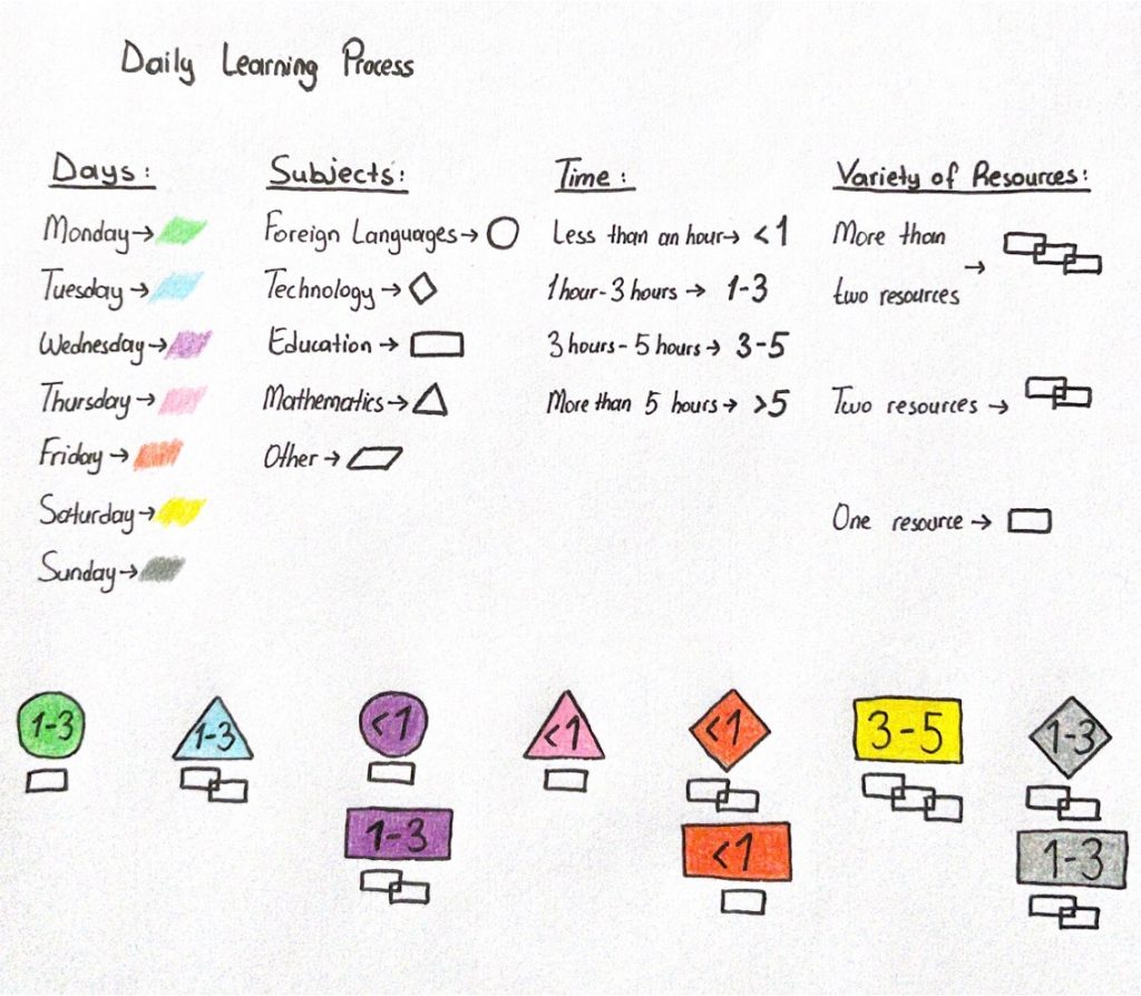
In my data visualisation, I created a visualisation of the “Daily Learning Process”. I used the visualisation for a week. By using the same visualisation for more weeks, we might get some patterns. I classified them into 4 main parts; days, subjects, time, and variety of resources. I used days – times for understanding the pattern and, subjects – the variety of resources for getting feedback. This visualisation shows an individualized learning process. It can be used as a small directing learning system. Personalized learning has a connection with learning management systems (Bulger, 2016).
By using this visualisation, we can see the approximate hours of learning we got from specific subjects and this can be feedback for us to change or save our learning methods or time.
While drawing my data visualisation, I thought about what kind of feedback a software might give me if it has these data. Probably, it might say that this individual can spare more time for learning on weekdays but for an individual who is working on weekdays it is too hard. So, the software should also have this information. On the other hand, machine learning can be helpful in these situations. With machine learning, some activities can be predicted by using the data (Knox, Williamson, Bayne 2020). Like I said before, if this system would be used for more weeks there might be patterns occur. With these patterns, the feedback can be more useful for the individual.
References:
Bulger, M. (2016). Personalized learning: the conversations we’re not having. Data and Society Research Institute.
Knox, J., Williamson, B., & Bayne, S. (2020). Machine behaviourism: Future visions of ‘learnification’and ‘datafication’across humans and digital technologies. Learning, Media and Technology, 45(1), 31-45.
2 responses to “Data Visualisation – learning”
Merve, your simple visualization captures very effectively both the potential benefits and the significant limitations of data that can be captured about ‘learning’. I wonder if you could reflect just a bit more on what aspects of learning are being captured in your visualization. To be sure, there is plenty of learning software available that will capture which resources a student accesses, and for how long. Over time, as you say, that might even start to reveal patterns. I could imagine, for example, a student being prompted with reminders to increase their study time if their ‘learning progress’ was deemed to be below average. But do resources accessed and time spent studying make good measures of ‘learning’, or are these just simplified proxies for much more complex processes and actions? If you look based at the reading from Monica Bulger on ‘personalized learning’, does she suggest any particular limitations of systems that collect data about learning and which then are supposed to offer individualized feedback or prompts to improve learning in some way?
I tried to show the variety of resources used and topics covered in the learning process. With this data, a student can see which types of resources are more beneficial for learning by observing the process longer time. It is hard to show the efficiency of the learning and how much learning happened during the time in my data visualisation. In that part, some evaluation results can be added to the visualisation to see the learning progress. As mentioned in Monica Bulger’s article, it is hard to expect a responsive system to prompt learning as teachers do (Bulger 2016). This might be a limitation of personalized systems used in schools. These systems are directing students to different resources that can help them to improve their learning (Bulger 2016).