Block 1 Data Visualisation and Blog
During this block, we have explored the impact data has and could have in various educational contexts. Student agency, data ethics, datification of learning and interpretation of personalised learning are all themes from this block’s reading list.
Aim of the visualisation
For this block’s data visualisation, I wanted to focus on my relationship with data in my context as a teacher working in primary education. I initially wanted to explore some of the responsive learning systems we employ in school related to interventions; however, since this is a public-facing blog, I didn’t want to disclose too much information about my current establishment or students. By exploring my relationship with data in my role at school, I was confident that this would help me reflect on my students’ relationship with data and the systems we encourage (if not force) them to use during their time in primary education.
Data collection
Since Week 5 of this teaching block coincided with a half-term holiday, I spent three working days in Week 4 recording the various online platforms I interacted with to do my job. I noted the system’s name in a Google Sheet and the purpose of that interaction as often as possible. In addition, I reviewed my internet search history to fill in the interactions I had missed or forgotten. I didn’t record ‘mundane’ interactions, e.g. basic email replies or internet searches.
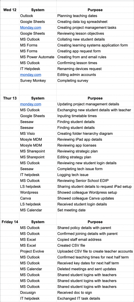
Data Patterns
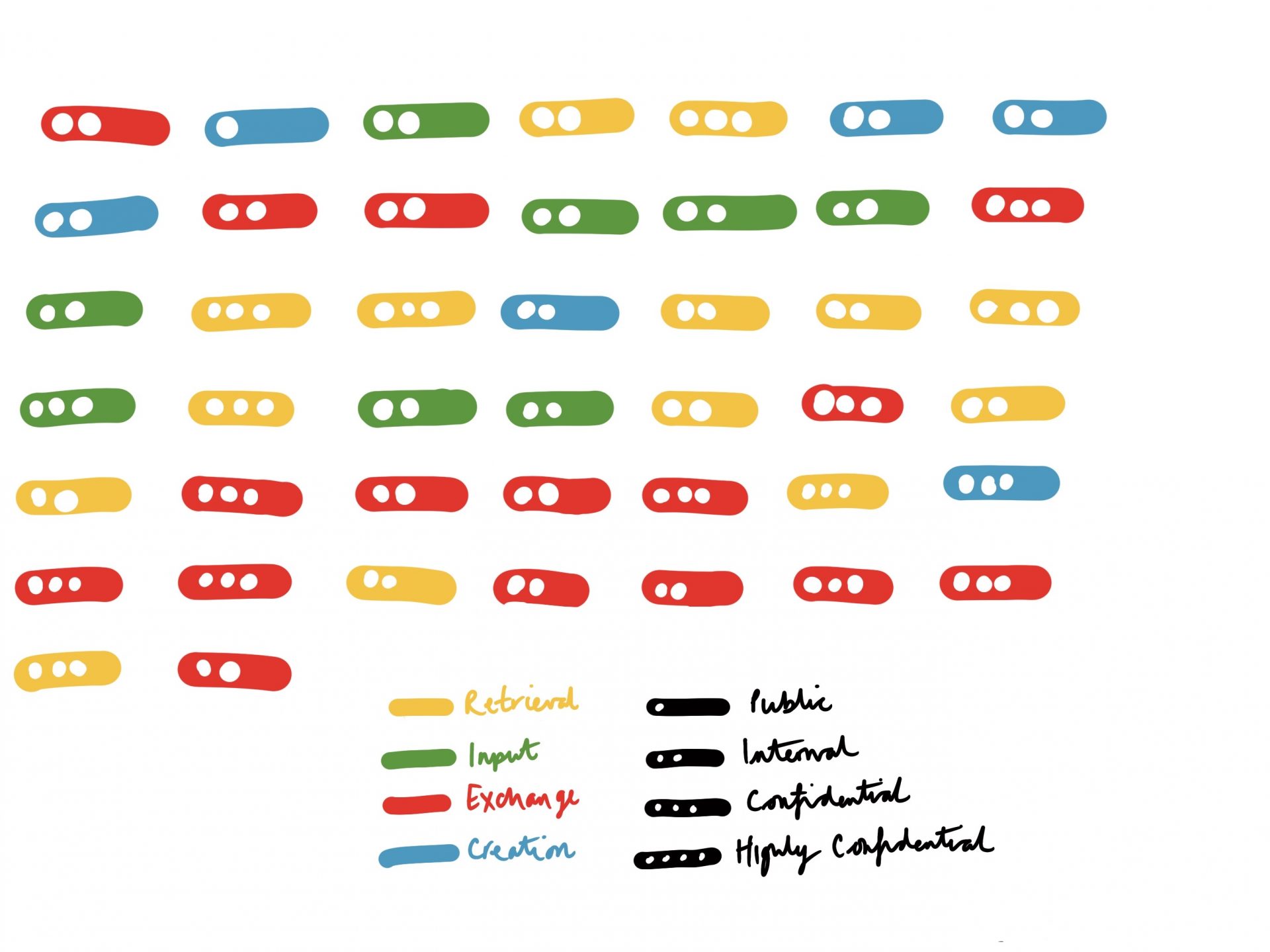
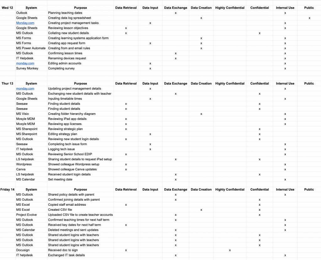
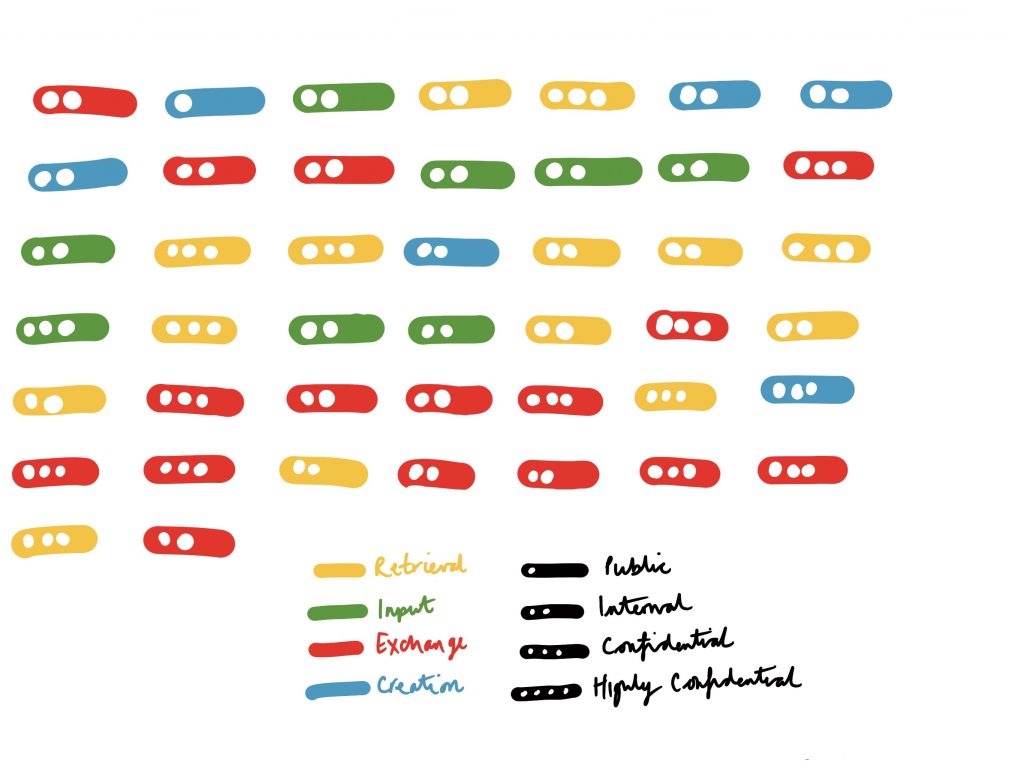
After the first day, I observed a pattern emerging from my interactions. I noted that I could separate these interactions into four distinct categories: data retrieval, data input, data exchange and data creation.
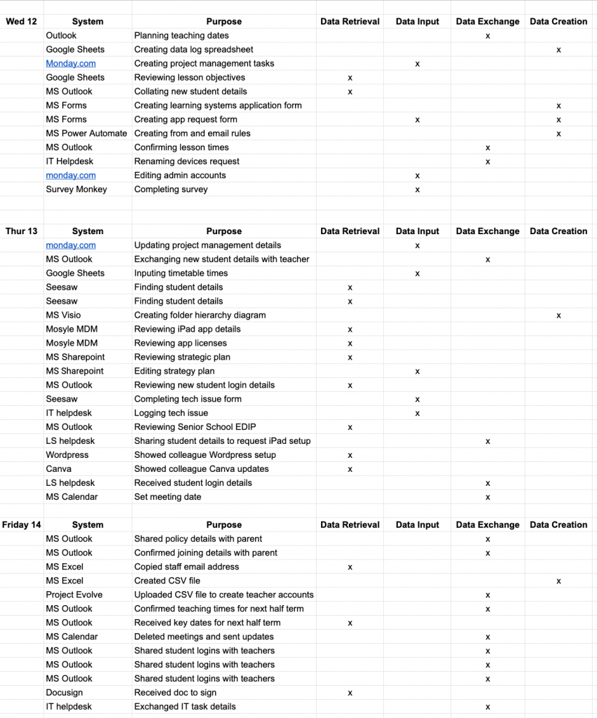
In addition to data type, I also referred to the school’s guidance on data privacy classification. Our school classifies data as highly confidential, confidential, internal, or public. For the actual visualisation, I opted to focus on the data types and privacy classification rather than what particular systems I used. This has allowed me to reflect more on the data than the platforms.
The completed visualisation
Reflection
I was surprised with the overall result of the visualisation. Despite the observation period being relatively short, I had anticipated seeing more instances of data input and data creation due to my work. However, there seems to be an even spread of data retrieval and exchange. The number of data exchanges was thought-provoking; it has undoubtedly made me more aware of how often I share (what our school considers) confidential information with colleagues through digital means. It has perhaps reinforced my views on the importance of data privacy and security in schools, as well as forced me to reflect on how much student data we store, access and share.
Hi Craig, I love the layers that you worked through to get to the end analysis!
I was wondering if you think the data would change as the year progresses.
Also, it struck me just how much of the data was ‘administrative’ related. It is a good example of how teachers have to spread their time across many tasks, not just teaching the group they have in front of them. Even if tasks are small the volume of small tasks must take up quite a bit of time?
This is a very attractive and deceptively simple visualisation, worthy of comparison with Lupi and Posavec’s postcards! I like the way you’ve used organic shapes to display the hard data you collected in Google Sheets because it seems to communicate something of the choice and complexity lying behind seemingly straightforward data productions.
You’ve made thoughtful decisions about the sort of data to collect and carried your concern about student and institution data privacy through to your eventual data ‘analysis’. I thought your data collection methods were set out clearly and your idea to check your search history suggested a comparison between human and automated data-collection systems!
I particularly appreciated the way you analysed your data and identified a pattern that enabled you to ‘cut’ the information in a revealing way. The visualisation appeared to really work by surprising you with new insights about data exchange at your institution. There’s lots to think about here in terms of thinking how data productions can be reductive and/or productive of novel insights, well done!