
Block 3 Visualisation and Blog
The context for this block’s data visualisation
In 2021, my school was subjected to a ransomware attack. Fortunately, the outcome was not severe, but it prompted our senior leaders to think deeply about our relationship with data – especially from outside sources. As a result, the school is completing an ISO 27001 audit to evaluate our IT systems and policies.
As a result of the audit, new policies have been created to meet the standard for certification. This may be an example of fast-policy creation as the school tries to ensure that they meet expectations – quickly. We have an external, non-political agency helping us shape our policy.
Data visualisation
For this block, I wanted to continue the theme of my relationship with data. I choose to compare our academic policies with the new policies linked to technology and data use. What might the comparison show me? To begin, I chose the main academic policies and the technology and data policies displayed on our school handbook intranet site.
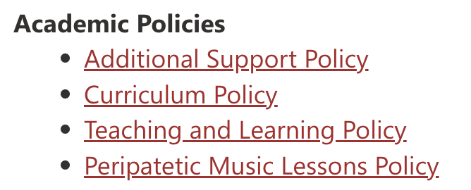
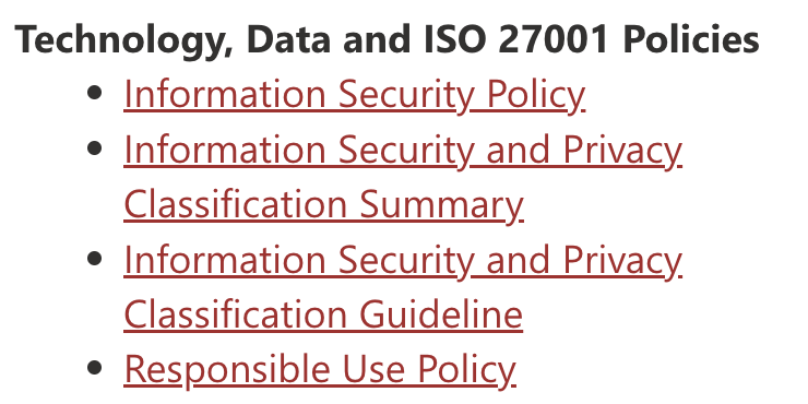
There are approximately 45 other policies linked to the ISO 27001 audit, but for brevity, I opted to compare the policies displayed on the main page of the school handbook intranet site.
To compare, I wanted to look at word frequency in each policy. I hoped this would shed light on the main points being considered and whether those points differed between the academic policies and the technology and data ones.
Each policy was downloaded into Word format and pasted into the Lexicool website. A report was generated listing the most frequently used words. I recorded these for each policy in Google Sheets, removed duplicates and combined the results. The top ten from each list was used for the visualisation. I chose to remove ‘instrument’ from the top list in Academic Policies because it was repeatedly used in the music lesson policy.
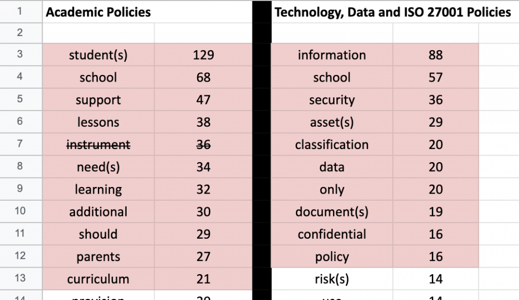
Using the word frequency results, I created the data visualisation below. In comparison to my previous entries, I opted not to create a key but instead displayed the relevant words clearly. I wanted to make the visualisation more transparent so that the reader could clearly see the difference in policies.
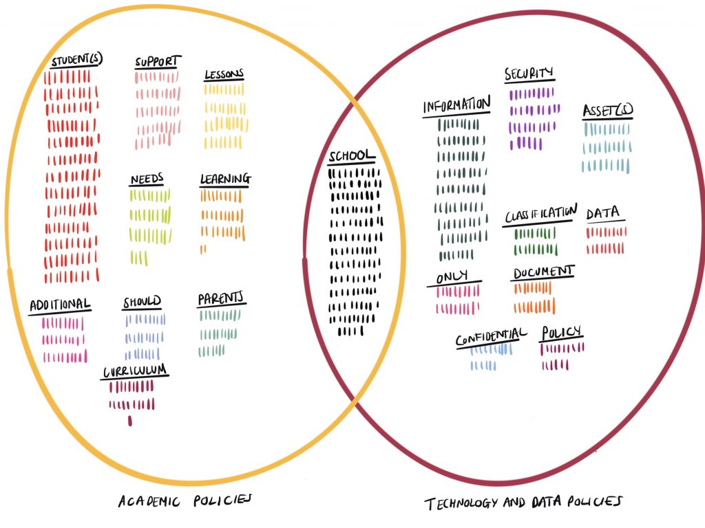
‘School’ is the only consitent term used across both policy categories, which shouldn’t be a big surprise, but I do wonder what the visualisation would look like if the other 45 technology and data policies were considered too.
What an inspired idea to compare terms from two policy sources for this block on governing with data Craig! I think it’s possible to discern some of the flavour of the two groups of documents, even with the small datasets you have put to such good use. I’m drawn to the technology group terms “classification”, “assets” and “security” as they are not only familiar data security terms, but they’re also indicative of pervasive narratives in which data are seen as valuable assets from which patterns may be identified, classifications made, and actionable information derived. Data rhetoric tends to divert critical approaches by concentrating on data security and privacy issues.
Another striking difference between the two lexicons is the higher incidence of people (students and parents) in the school documents, whereas the most frequent ‘subjects’ in the technical documents are the collective “staff” or the singular “owner”. (I only know this because you have helpfully provided the underlying data, not usually the case with headline visuals). As you say, such observations may be expected considering the nature of the two sets of data, but it is interesting that the only overlap is the school – ie the site that is “steered from a distance” (Gorur, 2018, p.93).
I can see that your decision not to use a key was bound up with wanting to create a clear visualisation that didn’t need one. This underlines the choices and decisions made about clarity and the “story” to impart which lies behind all data visualisations. You explained that you’d taken out ‘instruments’ from the Music policy for obvious reasons, and your mention of it resonated with the term ‘policy instruments’ and made me think of Dr Williamson’s paper on ‘Digital education governance: data visualization, predictive analytics, and ‘real-time’ policy instruments:
https://www.tandfonline.com/doi/full/10.1080/02680939.2015.1035758
Really great work Craig!
Gorur, R. (2018) “Escaping Numbers? Intimate Accounting and the challenge to numbers in Australia’s ‘Education Revolution’”, Science & Technology Studies, 31(4), pp. 89–108. doi: 10.23987/sts.56745.