
Visualising Screen Time
Inspired by Dear Data, I wanted to attempt another data visualisation using a theme and data set of my choice. As my visualisation practice, I choose to explore my screen time usage on my iPhone for over one week. I decided on screen time for two reasons: one, I knew the data had already been collected via my device, and two, I was curious about how I might display that usage.
While exploring the data from the screen time section of my iPhone, I knew I had to focus on a story. The data available was extensive, so I opted to focus on one aspect.

I created a visualisation of the top five apps that were used each day and their contribution to my screen time.
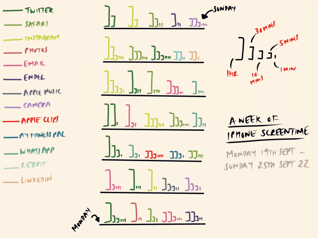
I opted just to focus on the top five apps from each day, to paint a picture of my usage over the week. I chose not to display overall screen time use for the day or the week as I felt this would overcomplicate my narrative. I did consider changing the lengths of the black lines for each day to show the total screen time of the day, but I wanted to keep this attempt simple.
There’s an interesting discussion here around how screen time data is collected and utilised – especially if this is part of Family Sharing and parents can monitor their child’s (or spouse’s!) usage. In terms of data use and privacy, it took some investigating to determine if the screen time data was private. There’s another discussion here around transparency of data collection and use.
I think it’s great that you are experimenting with visualisations and your work has been really productive for considering key questions about what data to capture, why and how best to present them.
I’m interested by your sense of having to “tell a story” with your screen time visualisation. Did you mean that there was so much data there you had to choose what to visualise and “keep it simple”? Was that for aesthetic reasons or for clarity? Does it tell the story / give you the information you intended?
I agree that there are important discussions to be had over privacy and transparency and you mentioned that “it took some investigating to determine if the screen time data was private”. What did you find out? Why should it be so onerous for the user? There are interesting links here to Carlos’ former use of the Forest app which I presume worked by gaining access to screen activity data? If so, it would be good to know how consent was gained – explicit or buried in Terms and Conditions?
In terms of telling a story, my interpretation and (current) understanding of data visualisation are that the purpose is to help an audience make sense of that ‘big data’. In my example, there isn’t a lot of data, but I was very conscious of presenting it in such a way that it could be understood easily.