
Communication flow
One of the key themes across various block readings that struck me was the volume of information captured and collected on learners as they interact with digital technologies. As Brown (2020) notes the ‘data deluge’, or in wider societal terms the ‘datafication’ of our lives, as Williamson et al (2020) highlight ‘contemporary culture is increasingly defined by data, indicators and metrics’, going on to consider the impact of defining ‘what is rendered visible or left invisible’ and how this affects the value of what is being measured. This wide array of information and its interpretation is then presented to teachers to assist monitoring progression and enhancing the learner experience. This volume of information cascaded to teachers raises questions for me in relation to:
- How does the set up or configuration of EdTech platforms etc affect the output of the data collected.
- Does the presentation of the data on dashboards affect how the information is then interpreted.
- How does this volume of information presented affect teacher, judgements, decision making and learning practices?
These questions inspired me to consider a visualisation around communication. Specifically, information or requests present to me, at work, and within a set a time limited period (48 hours). I set out to capture:
- How the information or request was communicated to me.
- If I was required to undertake:
- a specific action
- absorb and/or store information
- provide an opinion on a general or corporate policy matter, not directly related to my portfolio of work.
The data shown below shows my initial attempts at an initial data capture.
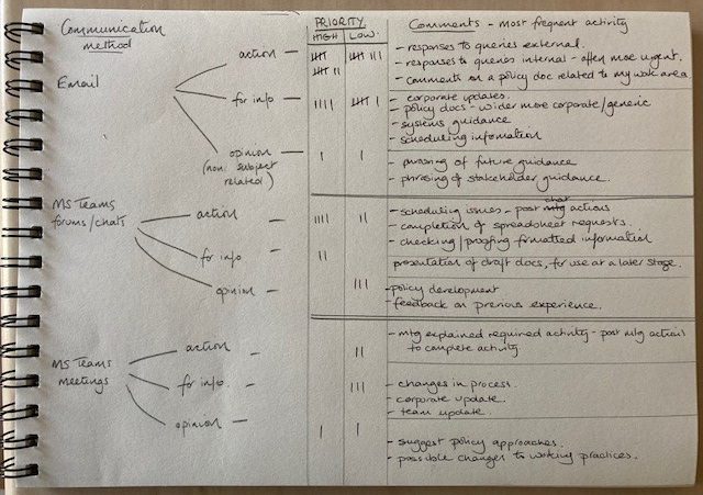
I realised early on that my ‘comments’ were more interesting than either the communication method or the priority rating. This may be due to me noticing areas where efficiencies could have been made as I was supplying similar information to different stakeholders.
It made me wonder if a snapshot was taken of similar information across a wide range of staff if others in the organisation would find the same? If so, would there be scope to consider ways to streamline information sharing to avoid repetition. Alternatively, they may not have come to the same conclusions that I did due to differences in interpretation.
Does providing a ‘wealth’ of information on student progress lead to teachers making individualised interpretations of the data presented with perhaps different teachers reaching different conclusions on similar data, or is their scope for discussion across peers who all have access to the same information to find a common understanding, therefore also discussing and agreeing ways forward? Alternatively, does the sharing of learner data pose to much concern for teachers as comparisons and assumptions could be extracted from the data on the teacher and their teaching practices? Would I be concerned if a co-worker commented on data capture of my communications?
Taking this a step further I wondered if the people I interacted with would have communicated with me differently if they had known I was logging the interaction? Would the interaction have been more, or less, formal? Would they have considered if the information they were asking for was elsewhere already before asking? Essentially does the knowledge that information is being recording affect behaviour.
In this respect I was intrigued by the reference Brown (2020) makes to lecture in his study no longer relying on a show of hands (‘which were never counted anyway’) but instead now used the digital tech available to capture precise information. This change of practice does give the lecturer far more reliable information on student performance from a class and individual perspective; however, I wonder if this very subtle switch from a ‘show of hands’ to ‘digital technology answer selection’ has an effect on the learners in the room? By which I mean that learners no longer must visibly commit to an answer or preference in front of the class by carrying out a physical activity but instead, although still an action, are able to select an answer invisible to their peers.
These reflections have been a nice detour away from my data and my consideration of how best to visualise the data, but I now have a better appreciation perhaps of what I might make ‘visible or invisible’ depending on what value I place on each piece of data.
References
Brown, M (2020) Seeing students at scale: how faculty in large lecture courses act upon learning analytics dashboard data, Teaching in Higher Education, 25:4, 384-400, DOI: 10.1080/13562517.2019.1698540
Williamson, B. Bayne, S. & Shay, S. (2020) The datafication of teaching in Higher Education: critical issues and perspectives, Teaching in Higher Education, 25:4, 351-365, DOI: 10.1080/13562517.2020.1748811
You have made a lot of interesting reflections centred around visibility and communication here Jillian, well done!
They raise important course themes such as decisions about what data to collect, the possible emergence of new patterns or perspectives, choosing what to visibilise (and therefore what to leave unapparent) and how to visualise it in order to guide its interpretation through design choices. You’ve also pivoted ideas on visibility and communication to think about how individual student behaviour and teacher/learner relationships might be affected by the gathering of digital data rather than a public showing of hands. There’s a lot here and I’m looking forward to seeing which area you might develop.
You might find this introduction to research on ‘managing visibilities’ in a digital age interesting. Under various headings such as opacity, transparency, surveillance and disclosure it investigates ‘the organisational, political and societal dynamics of seeing and knowing’: Flyverblom et. al, (2016) The Management of Visibilities in the Digital Age
https://www.researchgate.net/publication/290495833_The_management_of_visibilities_in_the_digital_age
Thanks Cathy, the doc link is really interesting (only had a quick read so far) but I think I might revisit this in the next block! The new pattern/perspective or trend was what definitely was more obvious to me during this visualisation though it did feature previously too. It certainly did make me think more about potential issues in value judgements made on data when it is being selected and then analysed. So issues could be present in the ‘system’ even before it is presented to a teacher/tutor for them to interpret. So many steps to consider!