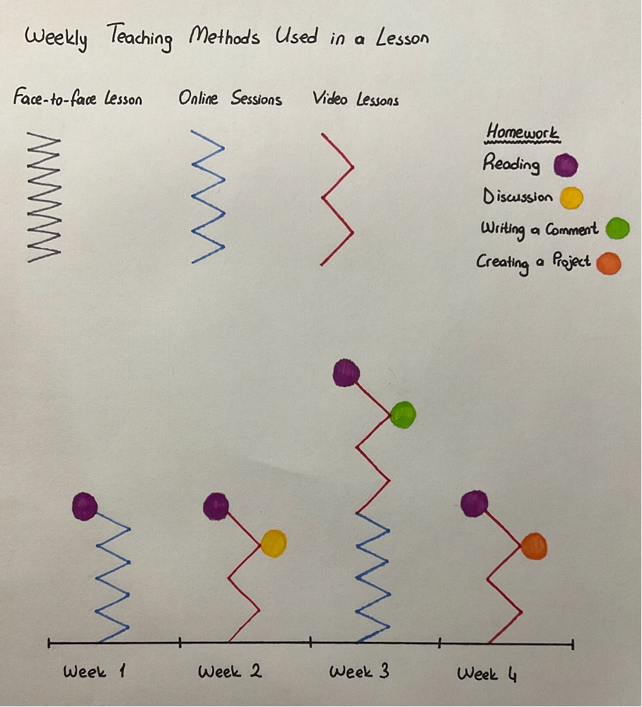
I created a data visualisation about “Weekly Teaching Methods Used in a Lesson”. I tried to differentiate the teaching and the learning part from this perspective; the points I used in my data are methods decided by teachers as a way of teaching. The zigzags represent the way of teaching and the coloured circles are the homework types. The distance between the zigzag lines represents the distance between the student and the teacher. In face-to-face lessons, there are more frequent lines in zigzag. As a summary, I created a visualisation for understanding the variety of methods used in a lesson during a period of time.
As mentioned in Brown’s article, data taken from students can help teachers to shape their lessons (Brown 2020). This shaping can be during the lesson or for the next lessons. For example, a teacher can realise that students are struggling with a topic with a quick evaluation application. Teachers can change the teaching method or repeat that topic according to students’ needs.
For following students and improving teaching many companies are creating different platforms that can be used in schools (van Dijck, Poell, de Waal 2018). As a teacher, while searching for teaching applications, I’m seeing very different types of platforms. Some platforms include parents and some of them do not, platforms include different data sets for improving teaching. In schools, teachers are using the data they get from the platforms. Besides this, the government or different companies are collecting data about students (Williamson, Bayne, and Shay 2020).
As written in the previous paragraph, teachers are using the platforms for improving their teaching and helping students according to the data they got. There are also some types of platforms that are giving feedback to students on their own. Computers don’t have equal pedagogical communication with students as teachers (Williamson, Bayne, and Shay 2020).. Shaping a lesson do not always about repeating the topic once more. It can be changing the style or changing the visuals or materials used during the lesson. It might be hard for a platform to understand students’ needs all the time. This might be a point that the using data for the teaching area is working on
References:
Brown, M. (2020). Seeing students at scale: How faculty in large lecture courses
act upon learning analytics dashboard data. Teaching in Higher
Education, 25(4), 384-400.
Van Dijck, J., Poell, T., & De Waal, M. (2018). Chapter 6: Education, In The
platform society, Oxford University Press.
Williamson, B., Bayne, S., & Shay, S. (2020). The datafication of teaching in
Higher Education: critical issues and perspectives. Teaching in Higher
Education, 25(4), 351-365.
One response to “Data Visualisation – Teaching”
I really like the visualization using the zig-zags to represent teacher-student proximity Merve. It’s simple and effective. I wonder what this could look like if you had access to a bigger sample of students and staff on different courses. I’m imagining it could be possible to create comparisons of teacher-student proximity, and then correlate those measures of proximity with things like academic outcomes. This is the kind of thing that large learning platforms can do. They can take measures that relate to processes and correlate them with outcomes, and use those data to claim that certain processes lead to better outcomes than others. Given the readings for the course so far, do you think there could be any problems with such an approach? Does it prioritize crude measures of easily-observable processes over substance? This has long been one of the key concerns in critical studies of educational data: that the processes that are most easy to capture as data become the most consequential in terms of shaping teachers’ practices, affecting how teachers think about their students, or of being used as a measure to evaluate and judge teachers’ effectiveness. In the Brown reading, for example, data dashboards designed to allow teachers to view student activity and progress end up prioritizing narrow measures of ‘engagement’ – and construct a quantitative profile of a student as engaged or disengaged – but this could miss other important aspects of the pedagogic relationship that can’t be measured, like the substance of an email exchange, or a spoken conversation. Are there any important aspects of teaching that you think cannot be datafied? Should those aspects of teaching be protected from datafication?