I created a Data Visualisation about a school’s data collection types and their frequency. I used different symbols for different data collection types and different colours for frequency. The line symbolised a year.
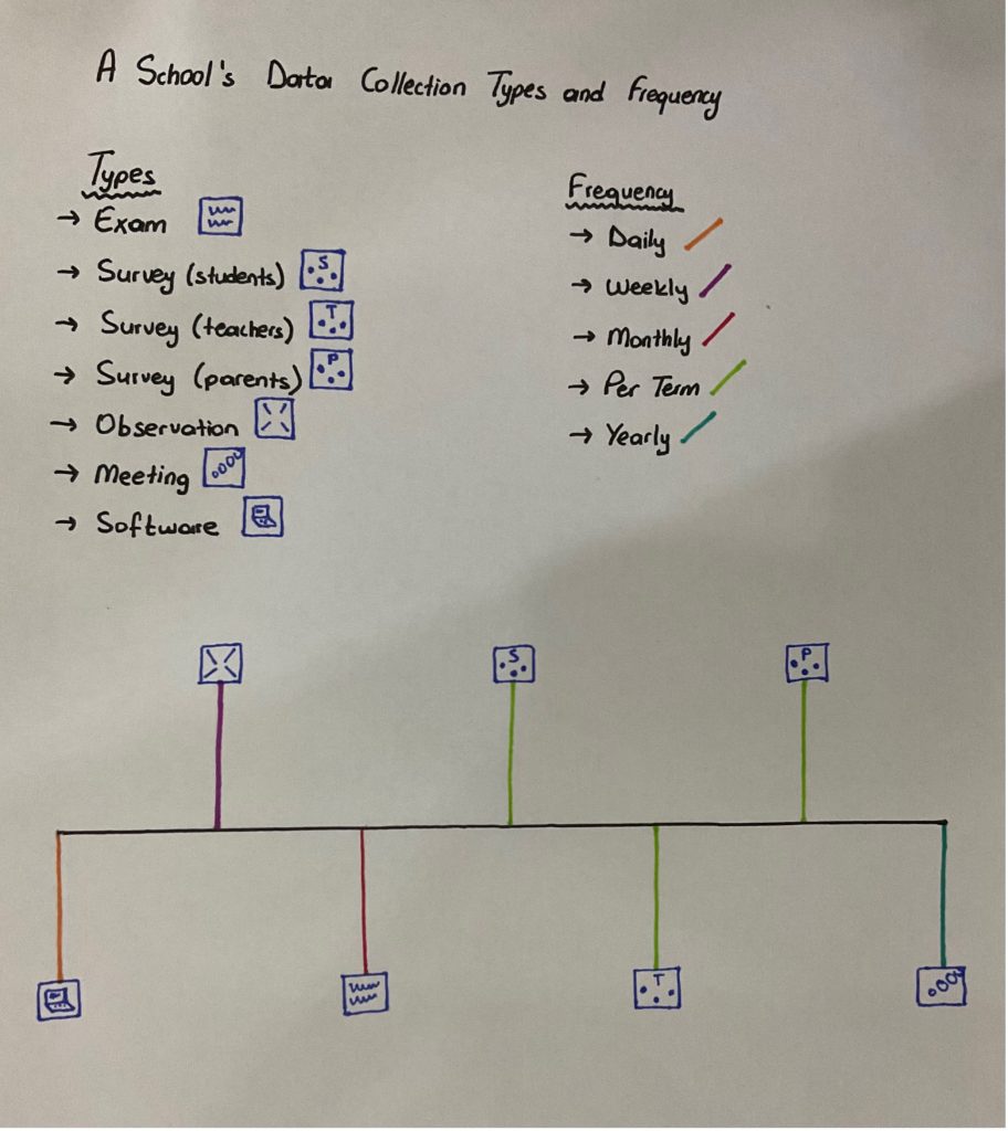
Tests, modelling, and technological programs help to analyse complicated data about education (Anagnostopoulos, Rutledge & Jacobsen 2013). In schools, everyday different types of data are collected. This can be students’ attendance, their exam results, or their choices of lessons. Some software can analyse these data and visualise them in a simple way for schools. Schools can use the data to improve education. Also, data can be used for prediction in schools (Ozga 2016). The result of analysis can help schools to do predictions and act according to the situation. In my data visualisation I would like to show the frequency and variation of data collection of a school.
Data about schools are not just used by school administrators. They can be also used by parents. Data of schools are used by parents to decide the school of their children (Anagnostopoulos, Rutledge & Jacobsen 2013). There are many different information and data we can easily find on the internet about schools. Most of the time schools have their own website for information and also there are some comments that parents can read.
References:
Anagnostopoulos, D., Rutledge, S.A. & Jacobsen, R. 2013. Introduction: Mapping the Information Infrastructure of Accountability. In, Anagnostopoulos, D., Rutledge, S.A. & Jacobsen, R. (Eds.) The Infrastructure of Accountability: Data use and the transformation of American education.
Ozga, J. 2016. Trust in numbers? Digital Education Governance and the inspection process. European Educational Research Journal, 15(1) pp.69-81
One response to “Data Visualisation – Governing”
This is another effective visualization Merve. I really like the way you have focused on schools’ data collection practices. Two things stand out to me here as you think about the final assignments. The first relates to the reading from Anagnostopoulos et al, which you’ve referenced. They talk about school data as being produced by a vast ‘infrastructure’ of technologies, people and policies. This makes me think of what kind of infrastructure underpins the data practices you’ve visualized above. Those surveys presumably sit on software of some kind. Where are observations recorded? And what kind of thinking is driving all of this recording and reporting of data in schools? For Anagnostopoulos and colleagues, writing in the US context, data infrastructures are built to enforce performance-based accountability. Is that the same in your own context? Is this all about constant measurable performance as a route to school improvement? And what does that say about the ways schools are governed (or indeed govern themselves)?
The second point you raise, and a good one, is about presenting data to parents. In a way, schools have been turned ‘inside out’ so parents can inspect their inner workings (as recorded as data) as a route to inform their own decision-making (eg about where to send their children). But again, what does this say about contemporary governance of schools? There is a logic here of market choice, and of parents as choosy consumers of schools. This might seem to sit at odds with notions of schooling as a public good, and as engines of equal opportunity. For example, making school data public can lead parents who can afford it to move location to ensure their children are in a catchment area for their preferred school, or pay for extra transport. The long-term effect is certain schools end up serving already-advantaged families, thereby generating ‘better’ data in terms of student grades, while other schools are left only with more disadvantaged students, and end up facing ‘special measures’ when their overall data appears to dip.