Governing with Data – Monzo visualisation
I decided to base my governing with data visualisation on the ideals of diligent financial behaviours after reading the statement in Prinsloo 2020 that ‘education is not neutral and always in service of ideology (Apple 2012)’ (Prinsloo, 2020).
My aim was to gain insight, categorise and understand my Monzo financial data so I can consciously spend money and predict what may affect my financial choices; similar to the way educational data is discussed as digital data making educational knowable, governable and intervenable (Williamson 2017). This does however introduce the issue of how the awareness of surveillance would affect behaviour and therefore the performance measurement (Anagnostopoulos, 2013).
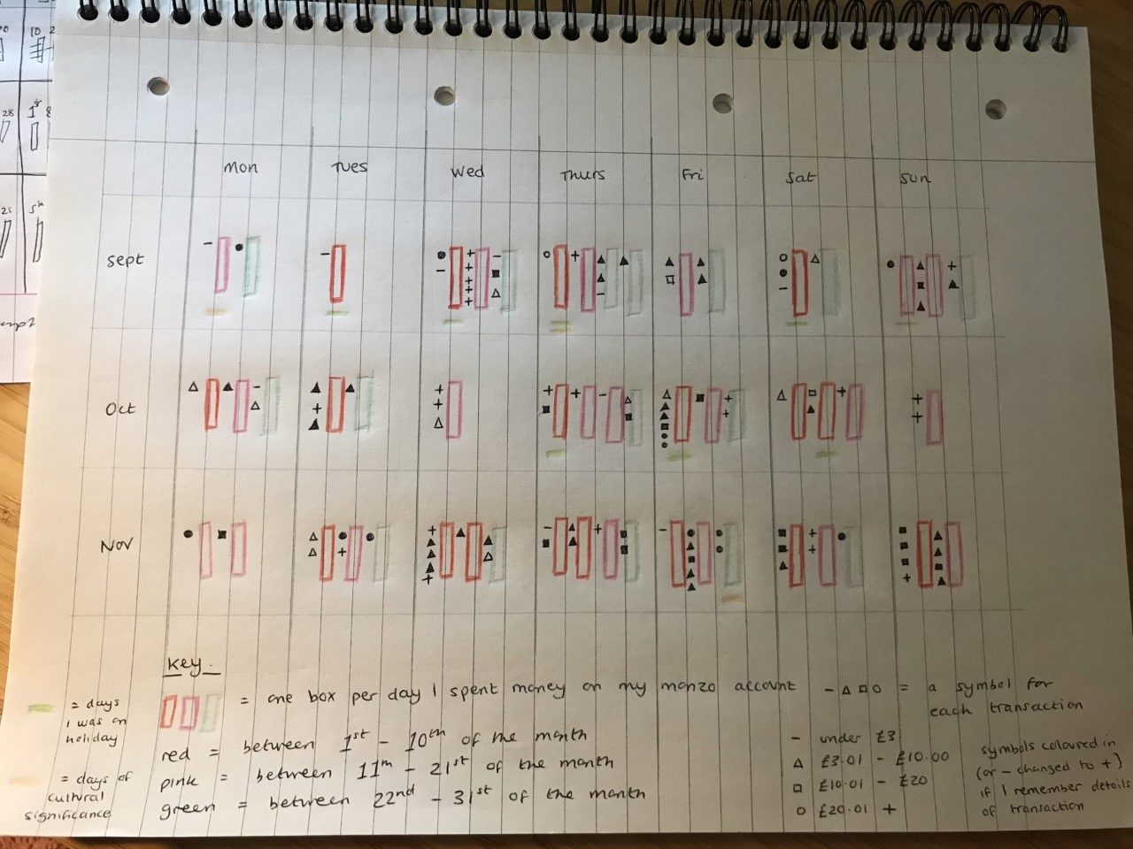
My visualisation shows the days that I spent money on my Monzo account, noting the day of the week, date category, number of transactions, categorisation of cost and whether I can remember the exact details of what the transaction was for.
Data patterning is discussed by Ozga 2016 in relational to Ofsted policy as a way for knowledgeable experts to synthesise their knowledge with digital data which can be quickly produced to create policies. In a similar way, I could use my data to create policies for myself to encourage conscious money choices. For example, the data suggests whilst Monday is the day I have the least transactions, it’s also the day where I remember proportionally less of the exact details of the transaction. Sunday is one of the less frequent days I spend money (only 6 Sundays over the 3 months), but I remember 100% of the details of the transactions that took place. This could represent learning assumptions that I should try to avoid spending money on Mondays and wait until Sunday to make more deliberate financial choices. This data however is only helpful in enabling me to ask questions related to conscious financial activity and in the context of personal factors of my life, it cannot be taken as a concrete answers or proof. Similar to Selwyn’s caution against ‘systems thinking’ through which complex (and unsolvable) social problems associated with education can be seen as complex (but solvable) statistical problems’ (Ozga 2016). Data can make issues seem solvable through measurement, feeding into ideas of accountability and excluding nuance and personal factors.
The notion of ‘intimate accounting’ that data are more useful when ‘enacted in situ, close to the action they measure.’ (Williamson, 2017, p85) is highly applicable to my visualisation and the fact that it invites me to explore my data in relation to my personal contexts. This data would be less useful to an individual this wasn’t relevant to, but as my blog is public it could still give the means to be used as a comparative tool. Not on the same level as the OECD or parents viewing school league tables, but could be framed as useful to another’s decision-making process. My visualisation should be taken as a representation of my activity, not an exact measure nor free from social or personal factors.
References
Anagnostopoulos, D., Rutledge, S.A. & Jacobsen, R. 2013. Introduction: Mapping the Information Infrastructure of Accountability. In, Anagnostopoulos, D., Rutledge, S.A. & Jacobsen, R. (Eds.) The Infrastructure of Accountability: Data use and the transformation of American education.
Ozga, J. 2016. Trust in numbers? Digital Education Governance and the inspection process. European Educational Research Journal, 15(1) pp.69-81
Prinsloo, P. 2020. Data frontiers and frontiers of power in (higher) education: a view of/from the Global South. Teaching in Higher Education, 25(4) pp.366-383
Williamson, B. 2017. Digital Education Governance: political analytics, performativity and accountability. Chapter 4 in Big Data in Education: The digital future of learning, policy and practice. Sage.
Another extremely rich visualization. You are very effectively illustrating the painstaking work that goes into the production of data – work that is often performed out of the range of our perception, hidden inside of software systems. This is enabling you to ask good questions about the politics of data production and use in education. The choice to ‘datafy’ is never merely practical, as you’ve highlighted, but may often be infused with ideology – as your Ofsted example indicates. The choice to inspect schools, and to impose particular regimes of measurement on them, is a political choice. It involves particular standards of evaluation. It requires new forms of external expertise. It makes demands on those being measured. Datafying is therefore not only about measurement but has consequences – it changes the very thing being measured, sometimes in unintended ways or with perverse consequences. The patterns revealed from data – like the patterns of financial behaviour you have recorded here – don’t necessarily reveal explanations, and can lead to decision-making based on very partial views of the things (schools, students) being analyzed.