Third visualisation: How many “personalized” emails did I receive from the University?
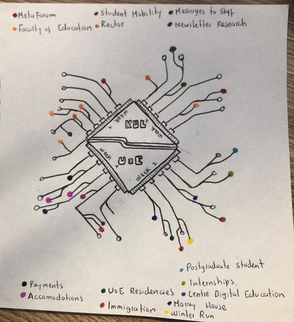
For this visualisation of “teaching with data”, I chose to track and graphically represent all the automatically generated, but personalized emails I received from the University for two weeks. I am referring to those messages that were directed specifically to me (“Dear Carlos”, etc) but that, at the same time, were also sent to different students with similar characteristics to mine (e.g. international students, graduate students, etc).
My purpose was twofold. First, I wanted to compare the number of emails that I received from the two different Universities I am currently enrolled in: The University of Edinburgh and the University of Leuven. Second, I wanted to see what types of emails did I receive from the Universities. My interest sparked mostly from reading chapter 6 of The Platform Society, by José van Dijck and colleagues. In there, she states:
“The conventional University business model reflects the ideology of higher education as a curriculum-based, comprehensive experience that focuses on Bildung; rather than churning out skilled workers, public education promoted the education of knowledgeable and critical citizens -a condition for healthy democracies”.
Once again, Van Dijk advances the distinction between education for the common good, characterized by a strong public presence that balances wider social inequalities, and “learnified” education (also explored in our previous module) that focuses on training skilled workers and infusing specific skills in them that are relevant for the market. Within this dichotomy, datafied practices mostly represent the potential for the rise of the latter at the expense of the former. In that sense, I wanted to explore what is the role that datified practices (in this case, sending personalized automated messages to students) play in the current University, and how it shapes the experience of students in it.
My claim:
In the previous section, we saw how learners are governed by numbers (measurements of performance, but also personal and social characteristics, etc). Now, proposing the image of the University-as-a-teacher (an institution with certain educational values that aim to be transmitted through the activities that happen inside of it), my running thesis for this post is that “numbers”, or my data profile that the University has, are also in charge of enhancing and even creating from scratch my sense of belonging to the University. My claim stems from my experience as an international student in two Universities with an ancient tradition of teaching and conducting research, that fit with Van Dijck’s portrayal of European higher education institutions.
From my experience, these emails played a big role in “making me feel at home” in the University, especially since Ph.D. students do not necessarily follow classes and have a rather independent, and even isolated, routine. Along with the relationship with my supervisor(s), probably these emails were my main source of information about the services, programs, events, and updates of the University. As you can see in the visualization, I received different messages about internships, student mobility, faculty-level events, and so on. I even received messages from the rector of KUL.
As a provisional conclusion, it might be possible to argue that datafied processes of personalization create “new geometries in the relationships” (equally to the case of MOOCs), but this time between the learner, and the home institution where s/he lives his/her educational experience. Of course, it is worthwhile to ask further questions about the benefits and possible dangers of engaging with students and creating a sense of belonging with personalized, yet automated strategies of communication and outreach.
Love the visualization Carlos. There are graphical suggestions of the university/ies as kind of ‘black boxes’: hard to see what’s going on inside, but we can generate inferences from the traces that surround them (in this case the emails). In that sense your post is suggestive of possible methodological approaches for understanding datafied institutions, such as universities. Even most educators cannot or do not know how to access some of the information it has recorded about students. But even interacting on Moodle generates data about students that the teacher might use to inform their practice (e.g. to ‘reach out’ to a disengaged student), and the student information portal of course issues regular reminders for educators to check boxes confirming engagement, which are then visualized to indicate rhythms of activity. I take your point about these data often being used a source of ‘personalized’ relationship building and care between the institution and the individual – as you describe it, ‘a sense of belonging to the university’ has become data-driven (and that may be a very positive thing). There is also something deeply intriguing about the range of data practices and systems involved in such personalization here – as you will be acutely aware, the ‘black box’ requires an awful lot of work on behalf of the student, administrators and educators to maintain it. In that sense, your post really highlights the human labour of automation, and all of the institutional demands that frame any automated system. I wonder how else one could go about researching the ways that data practices and data systems construct a ‘sense of belonging to the university’ – that would be a really interesting investigation to do.